The art of Web Designing is something that is becoming trendy nowadays. The page layout and how it would appear on different screen sizes is all you can expect from a good web designer. Eclectic ideas are brought up now and then because of the ever-changing technological period that humans are going through. Changing our preferences from desktop to laptop, laptop to cell phones, and cell phones to the future knows what!
The designer focuses on the page layout that can be easily viewed by the user. How to design a website so that they can keep the page without invading the content and images that are uploaded to make the site look more attractive is the essence. But there are certain setbacks when it comes to viewing the same site from different devices that have unequal screen sizes. So, how could one cope with the interface? Below are the answers to some of the questions regarding this issue!
Types of Web Design Layouts
1. Static Design
Originally, static layouts were the way of setting up a good page layout. These layouts had a width measuring about either 760 or 960 pixels and it didn’t change the width of the browser. The page size was pre-set and generally, it was kept around 960 pixels. However, the responsive design concept took place around 2010.
Due to the static layout of the pages, every page layout are viewed differently in different-sized screened devices. Just like a page opens normally in your desktop, but the same page on the phone is rendered petit due to the addition of the horizontal bars and the deletion of the web page.
Static layouts nowadays are obsolete and nearly no website designing services in India are willing to use it but some of them still prefer them as t is easier to make. Also in the hope of mutual understanding between the user and the designer amount his viewpoint. Let’s find out the benefits and drawbacks of this type of web design!
Benefits:
- User-Friendly
- Due to the same width for every browser, it is easier to surf without any setbacks.
- Minimum and Maximum width justification are not required.
- The legitimacy of the content is maintained at a larger resolution, even if it is viewed in smaller screens.
Cons:
- The width of the layout would determine the ion smaller screen which might require the horizontal bars.
- Due to the larger screen resolution, the white spaces occupy a tremendously large area disrupting the overall design.
- A major setback for screens with larger resolutions is the difficulty in the addition of textures, patterns and image continuation.
- They are low on popularity nowadays.
2. Responsive Design
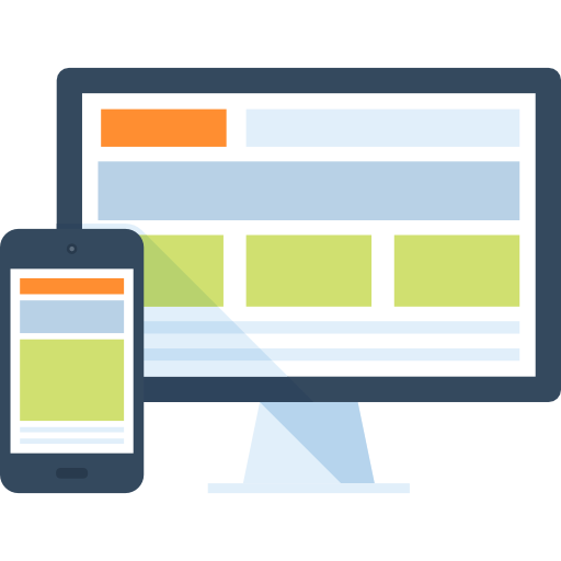
The better version of both – fluid and adaptive layouts. An ergonomic way of designing a page layout, x and y coordinates are used to build a grid for the layout. It majorly focuses on the percentage for various attributes rather than the fixed width parameters. By doing this a more organized and ergonomic way of adjustment takes place in the site and the page, no matter on what device you open, it will automatically adjust to the preferred resolution. Responsive Layouts are very renowned for its versatility to adapt to the browser screen resolution and thus the consumer generally goes for this particular layout.
Pros:
- It is up to the Designer what he/she wants us to see the site as.
- The efficiency of information conveyance is impeccable.
Cons:
- The load time is leveraged due to the HTML 5 structure that is linked to the CSS. The Responsive Layouts are generally a part of HTML 5.
- Certain restrictions are imbued due to the incompatibility of the HTML on all devices and hence the website might not be accessible.
3. Fluid Web Design
Fluid Layouts are generally more convenient to build nowadays. The general idea is that the page will adjust itself as per the screen’s resolution and as a result, the elements of the content and page will not remain same be wrapping itself with the browser window automatically. These layouts are now pre-defined by pixels rather than the percentage widths. It means it automatically re-adjusts according to the browser and the window size of the device.
The general belief about fluid layouts is that they are more accessible in a wider variety of browsers. They are easier to use and can be generally found in almost every website nowadays.
Benefits:
- They can set up automatically, on the user’s browser hence they are user-friendly.
- The white space is defined equally in all browsers and screen resolutions.
- The hindrance due to the Horizontal Bars goes off while peeking into the smaller resolutions.
Drawbacks:
- The problems regarding the designs of the page are shadowed due to the normality of the page on different screen resolutions.
- Taking the screen resolutions in mind, multiple widths are needed to be set to accommodate content like multimedia.
- White spaces might look a little too spacious due to the larger screen resolutions implying the lack of content on the page.
4. Adaptive Design
This is a more evolved way of page layouts. Adaptive Layouts are generally devised due to the idea of several versions of the layout appropriate to different devices with different screens. For example, if you view a site in a laptop the layout is different while the use of cell phones to view the same site has a different layout. The general idea is that the page layout determines the kind of device they are logged on and adjusts the page according to the screen resolution and changes the whole layout of the same page. While all the content and elements might be preserved, the version of the layout would be different than that of a laptop view.
Benefits:
- The ball is in the Designer’s court when it comes to how the site must be viewed. The Designer has full control of how the design can be viewed.
- The layouts can generally be devised for multiple viewpoints.
Drawbacks:
- The availability of the layouts is limited.
- There is always more than one option to the layout for the final output.
- Occasional maintenance is required essentially.
- A major setback is the loading time for these kinds of layouts. The speed a little slow.
Synopsis
People are exploring different possibilities and hence one idea is not the limit for them. They all want to experience the best and eliminate the worst. Following that, web designers must please the consumer to their utmost concern with eclectic ways to reimburse a design or show them a brand new design. Based on the different buyer’s personas one can decide what kind of design they need to work on for that particular consumer.
We, at World Web Technology, can help you decide which design layout is best for your website as we have served several businesses as a professional Website Design Company in India. You will find yourself satisfied with the option we offer to make your business count in the global ecosystem.
Most Popular Categories
Discover top categories on our blog, featuring WordPress, PHP, eCommerce, and Shopify insights and tutorials.
Featured Insights
Immerse yourself in our passion for sharing the latest industry news, cutting-edge technologies, and insightful articles. Explore the depths of knowledge with us.

April 22, 2025
The Future of AI in Digital Marketing Services in 2025!

April 16, 2025


