When it comes to website redesigning, an outdated one is the last one you want but relative to some website that was designed by you in the past, it definitely would look better. You might think that the site does not need any rigorous updates, it however does. No matter how high the customer might think about graphic design, it cannot beat technology.
8 Things to Consider While Website Redesigning Planning
For a website to run effectively there are about 8 elements that are required to update in the online market. These components comprise of technical elements, some require a knowledgeable digital agency, and others are just a hybrid of functionality and aesthetics.
1. Responsiveness
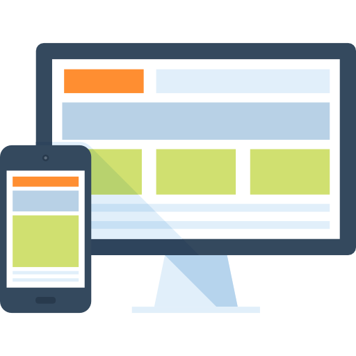
Years ago people got the opportunity to access the internet through their PCs which had huge monitors. After that people’s interest peaked in the mobile counterpart of the internet, which was accessible to all. Hence the user pattern for the internet changes with changing technology. Smartphones have replaced technological devices nowadays. Personal computers are bought by only those who are gamers or production people. Hence, the website should adjust with the kind of device it is being displayed on. If someone accesses the website on a PC, the resolution should change accordingly, if it is accessed on a smartphone or a tablet, it should change accordingly. This is what responsiveness is all about.
2. SEO
For your website to perform well in the search engine rankings, you need to optimize it on an annual basis and hence, it is known as Search Engine Optimization. During the time of the SEO, update make sure to check if it includes the H1, H2, and H3 tags, the short-tailed and long-tailed keywords as well. Lastly, make sure to put a focused effort to update the quality and quantity of the links that are bound to come in. Other SEO components include:
- Metadata rich in keywords
- Images of the product
- Social media links
- Local leads’ local and regional SEO
3. One page
One-page websites are now the trend of the world where the website provides a lot of content and thus you don’t need to open 600 menu tabs. It accommodates many users on the site so that they can scroll down through the endless-loading website which is also known as the one-page website. Due to the scrolling up or down option, it becomes very easy to hover through all the information and content.
With all the merits that follow one-page hybrids, certain demerits like the menu items should link to genuine different pages follows as well.
4. Heat Mapping
Content in the previous days of the internet was to be read from left to right like a brochure or a digital book. But nowadays, it is proven by the help of heat-mapping software that identifies and scans the most priceless information on a page and came to the conclusion that most people click ads on the left side of the page than the right side because they aren’t that much interested in the right and find reading the going through the whole page monotonous. Hence, they ignore things on the right.
The left and right content on a mobile interface are considered useless because the screen is so small it is hardly visible to the user. Hence, the content needs to be as close as the opening landing of the page. This kind of interface is inspired by the newspaper days where the content used to be folded in half and all the necessary stuff could be found at the top of the page above the fold.
5. Page Load
A quick load of the website is a must for any website nowadays. For this, your website page is properly optimized. One of the ways to load the contents of the page faster is to add the feature of the page-cache plugin where all the earlier loaded elements are loaded instantaneously. Other website redesign solutions include the hiring of the right web host as many web hosts have slow servers. The optimum page load speed for an ideal web host is shorter than 500 ms.
6. CTA
The most important thing for a website is to attract subscribers and buyers because the ultimate goal of your website is to attract as many customers as you can so that they can become your customers by buying your product. If there are no visits, your website might die away slowly and steadily. Hence, links of your website must be provided to other sites so that they can come and take a look at the content they were surfing on the previous website.
7. Multi-lingual
Nowadays language barrier is not an issue and it can easily be rid of by installing a plugin or menu that allows the site to be translated into many different languages and they all should be versatile as well. So make sure your website should be multi-lingual which is easy to install, profitable and inclusive of the cost.
8. Alt Text
It might become a tardy task for those who are visually impaired and they might find themselves in a pinch to find what ads and banners show what kind of products. As a result, the behind-the-code image should be updated which is called ‘text’ which is a text-to-speech software. It helps people know what the content says so that they can interpret the message of the ad or the banner without struggling.
Synopsis
These are the website redesigning guide that you must consider when redesigning your website. Better to hire Website design services company that can provide custom web design services to help you get the best website redesign solutions.
Most Popular Categories
Discover top categories on our blog, featuring WordPress, PHP, eCommerce, and Shopify insights and tutorials.
Featured Insights
Immerse yourself in our passion for sharing the latest industry news, cutting-edge technologies, and insightful articles. Explore the depths of knowledge with us.
March 26, 2025
Making Your WordPress Website Gen Z-Friendly: A Complete Guide!

March 20, 2025


